Architect
Office of Architetcure in Barcelona
Type of Area
Sea
Land/water interaction
Promenade
Sandy beach
Embankment
Built Environment Types
High built
Low green
Scale of Impact
District/ neighbourhood
City
Regional
Intervention Scale (Spatial)
Linear development – Single intervention
Project Types
Seafront development
Public space regeneration
Urban design
Urban/ Rural
Inner urban area
Visibility and Openness
Fully open
Full horizon
New Transitional Space between City and Sea.
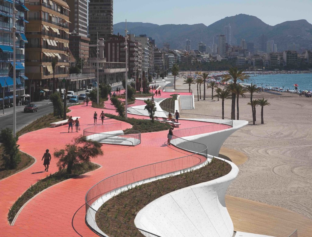
This project is another reworking of a promenade along the extremely busy beach at the bustling resort of Benidorm, designed by Carlos Ferrater at the Office of Architecture Barcelona and completed in 2009. A four-lane highway and lots of car parks with only limited access points down to the beach has been transformed by constructing a wave-like promenade with better access and also shade while reducing the traffic.
Benidorm has long since been a resort which has recently wished to improve its image and to move upmarket. Improving the beachfront and esplanade has been central to this. The promenade represents a crossover space between the urban and the natural, between the city and the sea. The architect designed it not as a frontier or hard border but as a fluid and porous space.
The promenade is designed for multi-functional activities, from walking to contemplating the sea views. Spaces for observation points and seating are therefore included. The design channels the longitudinal and transverse circulations to improve beach accessibility. In ways similar to the design at Dover, a series of sinuous interwoven lines is used to create a form which evokes natural and organic shapes similar to the motion of waves and tides and also the fractal structure of a cliff.
The promenade follows a three-layer structure: the first uses white concrete to establish the perimeter line; the second uses paving in different colours; the third layer comprises the street furniture and the water and vegetation. All these contribute to a unified and harmonious whole.
The place is also functional, as explained by the designer and clearly visible in the design: all aspects being brought together: the promenade, rest and relaxation area, vantage points, transition to the beach, architectural barriers, direct access to parking, rainwater collectors, beach lighting, road communication, integration of street furniture, services infrastructure, and so on.
Perception and Meaning
Place identity
Imageability
Focal point
Health and Wellbeing
Aesthetic experience
Place affordance
Interaction with Water
Visual

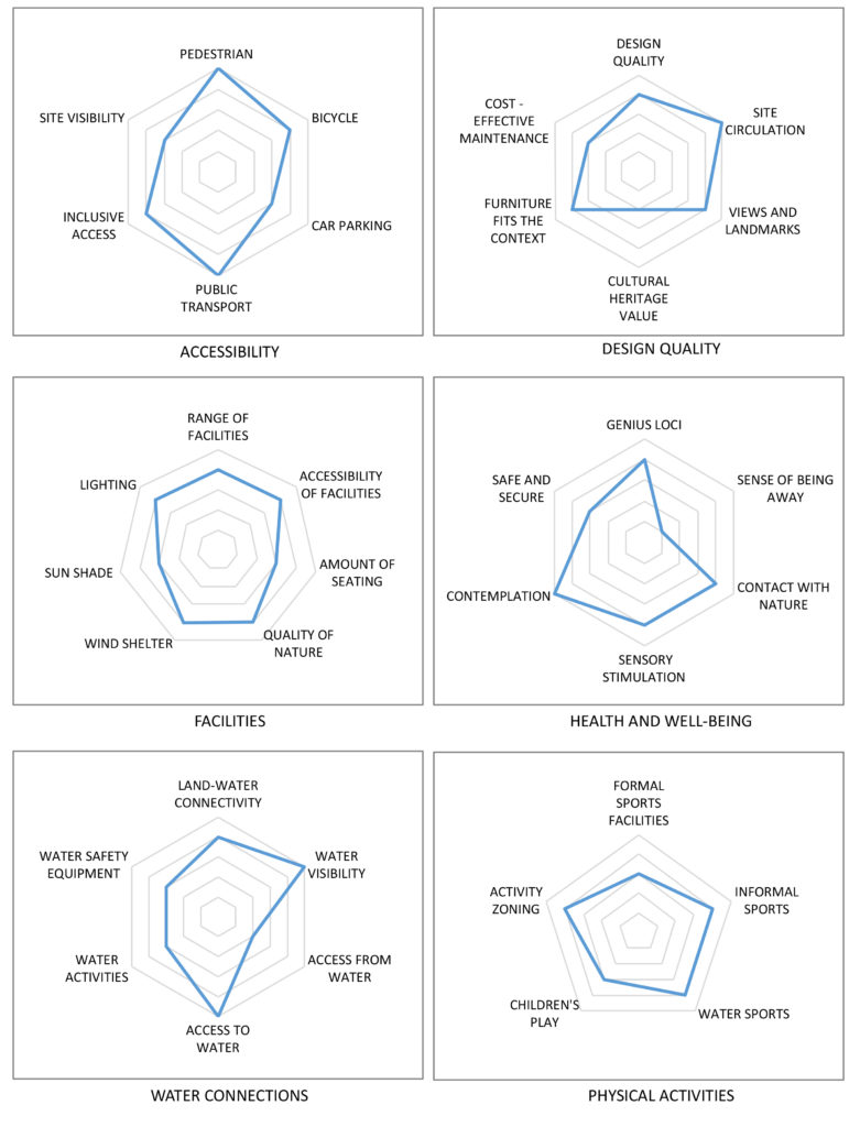
This project scores well for accessibility apart from its visibility from a distance and for car parking – deliberately reduced as one of the main design aims, so not a negative aspect here. The design quality is good although it scores low for cultural heritage aspects, due to the fact that there are none to take into account. It may also be rather costly to maintain.
It is well-endowed with facilities, although for such an extensive promenade the amount of seating seems to be rather low and it lacks shade in such a sun-exposed area and some areas may not be well-lit at night.
For health and well-being, being a very busy and urban place, it has limitations in a sense of being away, and may be a place with some risk to safety eg from crime due to the large numbers of relaxed visitors there. Water accessibility is very good except for access from the water (no jetties) and activities in the water – swimming of course but not a lot else.
The amount of safety equipment appears to be rather limited for such a busy beach. There are plenty of physical activities possible on the beach and also walking and jogging etc along the promenade itself. A very iconic and original design which creates a new image and strong genius loci.
